• 4 min read
Stock Market Heatmap: The complete guide
Scanning through hundreds of stock charts wastes time. A stock market heatmap shows you the entire market's performance in a single visual snapshot.
What is a stock heatmap?
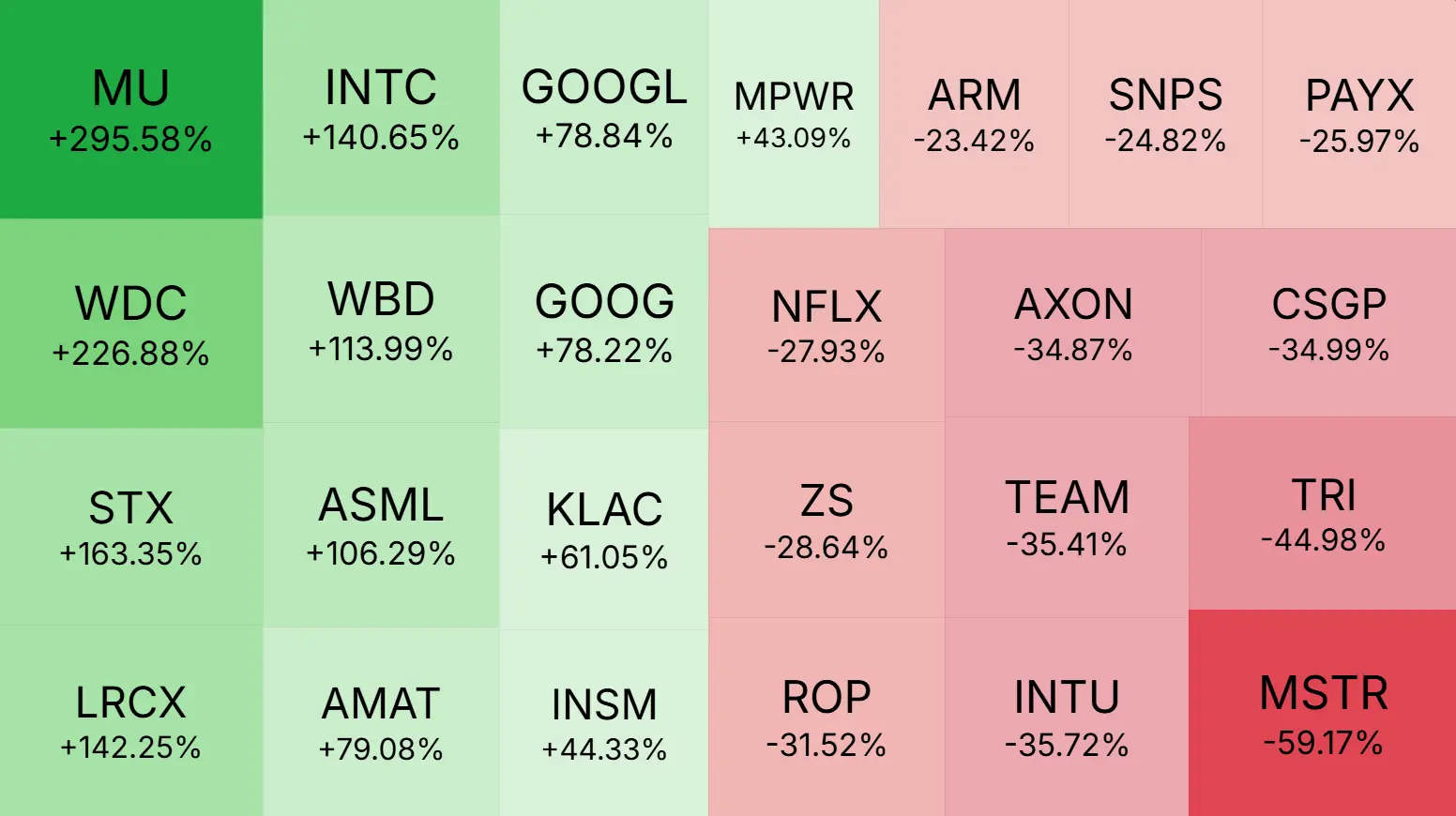
A stock heatmap is a visual representation that displays market performance using visual encoding methods like size, color, and intensity, where each block represents a stock.
Heatmaps transform overwhelming market data into instant visual patterns, revealing performance outliers and market trends in seconds.
How to read stock heatmap visual encoding
Stock market heatmaps use visual properties to communicate performance data. Different platforms use different encoding methods:
Color intensity is one common approach where deeper colors indicate stronger values (positive or negative). For example, a red to green spectrum might show losses to gains, or blue to red might show cold to hot performance.
Block sizing is another method where tile size represents the magnitude of a metric. In static heatmaps, block size typically reflects market capitalization. In dynamic heatmaps, tile size represents the metric being measured, with the largest blocks showing both the highest and lowest values, while median values appear as median sized blocks.
Combined approaches use both color and size simultaneously to display multiple dimensions of data at once.
The key principle remains consistent across all methods: visual intensity (whether through color, size, or both) indicates the magnitude of the value being measured.
What stock heatmaps reveal instantly
Heatmaps transform complex market data into visual patterns you can scan in seconds:
Outlier identification. Extreme visual intensity immediately highlights which stocks are performing dramatically different from the broader market. Tiles showing the most prominent visual properties (whether through size, color, or both) indicate values worth investigating.
Performance clusters. Heatmaps expose which stocks behave similarly based on the metric being measured. Whether tracking daily returns, profit margins, or revenue growth, clusters of similar visual patterns reveal groups of stocks moving together.
Top and bottom performers at a glance. Strong and weak companies reveal themselves through visual prominence. When analyzing fundamental metrics like profitability or growth rates, the most visually prominent tiles show you which stocks lead or lag their peers without manual comparison.
This is why experienced investors scan heatmaps first. Visual patterns reveal opportunities and risks faster than spreadsheets.
S&P 500 heatmap vs Nasdaq heatmap
Different heatmaps serve different purposes depending on your investment focus.
S&P 500 heatmap displays America's 500 largest companies across all sectors, providing the broadest view of overall market health and economic sector performance. Use this when you want to understand general market trends and identify rotating sector leadership.
Nasdaq heatmap concentrates on technology and growth stocks with heavier exposure to innovation driven companies. This reveals tech sector strength and growth stock sentiment, making it essential for monitoring momentum in high growth industries.
Superinvestor heatmap shows what legendary investors like Warren Buffett and Cathie Wood are buying and selling. Track the portfolios of proven investors to see which stocks are gaining or losing favor among the most successful money managers.
Sector heatmap groups stocks by sector regardless of index membership, showing which business types are winning regardless of company size. This helps identify economic cycle positioning and thematic investment opportunities.
Choose your heatmap based on your investment style: S&P 500 for diversified exposure, Nasdaq for growth focus, superinvestor portfolios to follow proven strategies, and sector maps for thematic investing.
Using trading heatmaps for intraday decisions
A trading heatmap updates in real time throughout market hours, helping active traders spot momentum shifts as they develop.
Watch for sudden visual changes in large blocks. These signal institutional money flow and potential trend reversals. When multiple stocks in a sector shift simultaneously, it often precedes broader sector weakness or strength.
Heatmaps also expose relative strength opportunities. If a stock maintains strong visual intensity while its sector weakens, it demonstrates exceptional fundamental strength worth investigating.
Stock market heatmap takeaways
Stock heatmaps answer a critical question: "What's happening across the entire market right now?"
Before analyzing individual stocks, always scan a market heatmap. You might discover that your struggling position is actually outperforming its sector, or that your "winning" stock is merely riding a sector wide wave with no individual merit.
This is how you separate company specific performance from market noise.